PORTFOLIO
SSA Earnings Queries System Modernization
Overview
This project was for the Social Security Administration (SSA) to modernize an old green screen enterprise application created in Cobalt, Earnings Queries, and replace it with a new web-based application.
SSA technicians use the Earnings Queries system to view and research customer and beneficiary earnings records. For example, if a customer wants to begin earning retirement benefits, an SSA technician must verify that they have the necessary work credits required to receive benefits using the Earnings Queries system. Another example is if a customer notices a discrepancy in their earnings record and reports it to SSA, such as a missing year or an incorrect earnings amount, an SSA technician uses Earnings Queries to research the customer’s work history to verify the error.
My Role
Lead UX Designer
UX Process
-
Product Discovery
-
User Discovery
-
Brainstorming: Creating conceptual models
-
Validation of conceptual model via usability testing
-
Analyze data from usability testing of conceptual model
-
Design of high-fidelity prototype
-
Usability Testing
-
Iteration and refinement as needed
The Problem
The UX team for this project consisted of myself, and 2 co-designers. We were able to conduct extensive discovery to learn about the Earnings Queries system, how it is used by SSA technicians, and why. We traveled to the SSA mail center in Wilkes-Barre, PA to see how SSA processes earnings submitted electronically or mailed-in by employers around the country.
We also spent a fews at the SSA Wabash field office performing discovery 3 rounds of discovery with various SSA technicians such as those who use the Earnings Queries system to process claims, technicians who assist beneficiaries via phone or as walk-ins, and technicians who assist employers with W-2 filings and other reports.
Discovery Findings
There are five queries that SSA technicians use to assist them with number holder claims or reported discrepancies:
-
Summary Earnings Query: A listing of earnings by year for a number holder
-
Detail Earnings Query: Details of earnings by year for a number holder including employer(s) information, and W2 information such as total wages, taxes paid, tips, Medicare, etc.
-
Employer Address Query: For searching employer addresses
-
Earnings Corrections: For correcting reported errors in earnings
-
Earnings Suspension Query: For searching for suspended benefits for a numberholder
Key findings obtained during product discovery (there was much more):
-
Each query is a separate screen and are not linked together. This means the technicians must go back and forth between green screens separately.
-
This becomes very cumbersome for the two queries that are used multiple times a day: Summary Earnings and Detail Earnings.
-
The Summary Earnings query and the Detailed earnings query are used the most. Technicians first query for an earnings summary for a numberholder which only shows the earnings by year. To see more earnings data, and employer data, the technician uses the Detailed Earnings query.
-
Some search results may contain more than one screen of data but application can only display one small screen at a time. They are unable to see the "full picture."
-
If there is over a certain amount of data in a search result, the results are automatically printed whether the user wants them printed or not.
-
The black background of the screens with the bright green type in capitalized type makes them harsh on the eyes and hard to read.
-
The layout of the data displayed on the screen is not well formatted, which makes it hard to interpret.
-
Technicians must begin an entire new search if they want to change search parameters. They are unable to change a first name, for example, and research. They must initiate a new search.
-
Help is not available within the current green screens; the technician must go to the SSA intranet if they need assistance
-
There are many codes and acronyms that aren’t spelled out and technicians don’t know what they mean
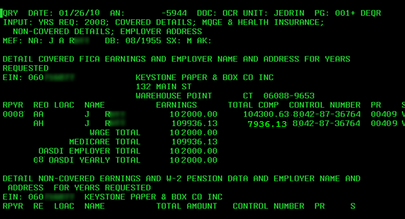
Screenshot of the old green screen system
An additional challenge we did not expect was that some technicians interviewed did not feel that a new system was needed. They thought the green screen system did everything they needed. This surprised us and we were curious how these technicians would react to a new design. We made a note to make sure we included them in our usability testing.
Personas
Using data obtained during discovery, we created 3 personas for SSA technicians that commonly use Earnings Queries. Personas incorporated common likes and dislikes, and pain points they had of the green-screen application as well as their wants, needs, and wishes for the new system. We also created user flows for each persona to capture how and why they use Earnings Queries.
Earnings Queries User Personas and Flows
Brainstorming a Conceptual Model
My team mates and I began brainstorming ideas for the new Earnings Queries application that would modernize the existing application as well as address user pain points, wants and needs. Some of our recommendations included:
-
A “one-stop shop” approach: Instead of forcing technicians to go back and forth between many screens to obtain data they need, create an earnings portal that allows users to easily access all queries from one screen beginning with one search.
-
Combine the Summary Earnings Query and Detailed Earnings Query into one query, allowing the user to drill down into earnings details from the summary earnings. Example: click on one year in the Summary Earnings to view details for that year.
-
Use the SSA User Experience Framework components to create a visually appealing and user-friendly design.
-
Provide contextual help at the point of need.
Validation of Conceptual Model
We decided to test our idea for a “one-stop approach” with SSA technicians to validate our conceptual model before formal prototyping began. Because we had yet to create a prototype, we sketched our conceptual model on paper.
We scanned our sketches and then put them into Axure to create a low-fidelity prototype of our paper sketches. We added simple functionality such as working buttons and links, show/hide containers that opened and closed, a few help/tool tips that opened, etc. We then tested our “paper prototype” with SSA Technicians using a prepared facilitator guide.
To view the paper prototype of our conceptual model and how we added functionality to it using Azure, please watch the following video:
Earnings Queries Paper Prototype Video
Conceptual Model Testing Results
The testing resulted in a high approval and acceptance from participants We obtained validation of our conceptual model! They loved the idea of combining the summary and detail earnings queries into one query. A few favorable outcomes and comments included:
-
They did not mind clicking a year or years in Summary earnings to drill down into Detail earnings
-
They liked that search parameters could be changed easily.
-
“Everything is on one screen; you don’t have to page through several different screens; I can just scroll.”
-
“I usually pull half dozen queries for one claim so being able to get to everything at once is nice.”
-
“I like that there will be fewer steps.”
-
“This is awesome. Pretty much what I’ve been hoping for. It’s pretty much how I would have drawn it up if you’d ask me to do that.
Design of High-fidelity Prototypes
Once we validated our conceptual model for the design of the new Earnings Queries application we began designing and building a high-fidelity interactive prototype in Axure. The UX team designed the Earnings Queries prototype using:
-
Knowledge of the current process and green screen functionality.
-
An understanding of the types of users, how and why they use earnings data.
-
Knowledge of their pain points with the green screen system, their likes and dislikes, their needs for the new system.
-
Findings from paper prototype testing, as well in input from the Product Owner and other team members.
-
The SSA User Experience Framework (UEF): a design library of over 70 patterns used for designing all SSA applications.
To see the prototype used for testing, and the interactive functionality we built using Axure you may view these videos:
-
Prototype Video 1: Social Security number search; search for one year or multiple years
-
Prototype Video 2: Ability to search for multiple SSNs
-
Prototype Video 3: Search results showing summary level details for the selected SSN including the number holder name, address, etc. and ability to drill down into detailed earnings which shows the number holder's employment history.
Usability Testing
Once the prototype was completed with the necessary screens and interactions, we planned and conducted usability testing using it. The goal was to:
-
Validate design and functionality using the high-fidelity prototype
-
Confirm assumptions and decisions by stakeholders and project team
-
Improve features and functionality by obtaining feedback from users. What did they like or dislike? What did they not understand?
-
Provide guidance for design iteration and for future features and functionality
A prepared Facilitator Guide was used to ensure that each participant was asked the same questions in a consistent manner. We gave participants a common scenario for which they could use new “new application” to completed earnings tasks. We used the following moderation techniques during each session:
-
Concurrent Think Aloud (CTA): CTA encourages participants to keep a running stream of consciousness by thinking aloud during the session. CTA can help moderators understand participants’ thoughts as they interact with the prototype and complete. Observing an individual’s behaviors while thinking aloud gives us the closest representation of what their experience would be in real life.
-
Concurrent Probing (CP): CP requires that the moderator ask follow-up questions of participants as they work on tasks. When they say something interesting, or do something unique, or seem confused, etc., the moderators will ask follow-up questions to probe for additional information.
Usability Testing Results
Usability testing results were positive. Participants rated the prototype for level of difficulty (with 1 being hard to use and 10 being easy to use). The final score was 9.5 out of 10 for ease of use! Even the technicians who didn’t think a new system was needed were very excited. We were happy that the high-fidelity prototype allowed them to see the possibilities for improving the user experience.
Of course, the testing results included some things that we did not think of. Some of the improvements participants asked for included:
-
Create an exit button that allows users to go back to their main application portal
-
Add additional help or instructional text
-
Provide users different options to display the results for multiple SSNs
-
Ability to print separate years of detail earnings instead of all years displayed on the screen
Golden Quotes
-
“I can see this will be a good tool. Layout and information is visible and clean. I wonder how fast it could be being web-based comparing to [the current system].”
-
“It works a lot better for me. It’s much cleaner and more modern. Gives all I need and leaves all extra garbage aside.”
-
“I like that you have the option that you can click on these years and you can do all or just specific ones. You’d have to go through pages and pages in [the current system].”
-
“It’s definitely better than what we have – much easier to see information.”
Project Summary
Out of all the projects I’ve included in my portfolio, this one “takes the cake” for a few reasons. The first one is because I liked being assigned to the project before any work had commenced. That provided the opportunity to learn about Earning Queries from the ground up. It was awesome that we were permitted the opportunity to do discovery off site from SSA at the Wilkes-Barre mail facility and the Wabash field office.
After discovery we had ample time and opportunity to brainstorm, create and test conceptual models long before the development team began coding. I thought our idea to create a working, low-fidelity prototype using sketches was unique, and it worked!
My team mates and I worked well together and I had the opportunity to mentor one of the three, who was a new hire in her first UX role, which I enjoyed.
Once development of the new system began, I was assigned to begin discovery on Earnings Corrections (the next project in my portfolio) another team mate managed iteration of designs from that point on.
Some Kudos!
The Earning Queries project was honored with an Honors award from the Deputy Commissioner of Systems for recognition of the outstanding teamwork in creating, streamlining and transforming the modernized summary and detailed earnings web screens for over 40,000 front line employees to support claims.